 |
| Photo: Sussman-Prejza |
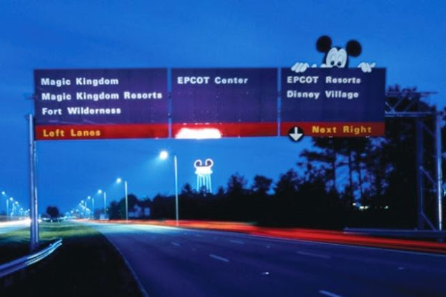
Have you ever noticed how easy it is to get around Walt Disney World? Every destination you're looking for on property is clearly displayed in a series of interestingly colored signs, making it easy to get from here to there. So where did these uniquely Walt Disney World road signs come from? To answer this we have to go back to 1971 when Walt Disney World was much smaller and only had one major roadway.
To understand how Disney is able to develop their own road signage it is important to know that Walt Disney World is part of the Reedy Creek Improvement District. This special district is a governing body created in 1967 by Florida's legislature to encompass the 48 square miles that make up Walt Disney World. This special district gives Disney the ability to write their own building codes, maintain their own power plants, provide emergency services, and build and maintain roadways. It's for this reason that Walt Disney World is allowed to break from the traditional green and white signs that dot the highways and freeways around the country. With that said, back to the story.
Back in 1971, guests traveling to Walt Disney World would drive miles without even knowing they were on Disney property. It was not until they saw the Magic Kingdom's toll plaza did they know for sure that they were at Walt Disney World. For directional signs they used more traditional signs. Throughout the 1970s Walt Disney World adopted a series of road signs that Disney deemed better looking. These signs were brown with white lettering. These designs remained well into the 1980s, but as Walt Disney World readied for a major expansion, the signage that lined the roads of Walt Disney World would require some updating. Inspiration for the new signage would come from across the country at the 1984 Olympics in Los Angeles.
 |
| Graphic Design for '84 Olympics | Photo: Sussman-Prejza |
The design firm of Sussman-Prejza was responsible for designing the look of the 1984 Olympics. They created a series of graphics and developed a color scheme that were used throughout the venues and city. Road signage designed by the firm helped Olympic visitors navigate from event to event with greater ease. This impressed Disney's CEO Michael Eisner. He wanted the firm to create a style that defined Walt Disney World in the same way they defined the 1984 Olympics.
In 1989, Eisner hired the firm to design signage and graphics to help guests navigate the sprawling resort. The signage had to be easy to follow for guests, and signage had to be versatile so when expansion happened at the resort, the signage could easily be adapted. With their task defined, the firm defended on Walt Disney World to find ways of organizing the resort. They decided to organize the resort into "districts". There were six districts defined by the firm. Each district was anchored by either a theme park like Magic Kingdom or Epcot or a place with a high concentration of guests like the Walt Disney World Village Marketplace (now Disney Springs) or Fort Wilderness. A hierarchy of signage was developed to help guests get around the resort. This system meant that guests did not have to read through a litany of destinations. Instead, guests would head for one of the six districts. Once they arrived at the district a series of signs listing the destinations within the district would help guide guests to their final destination.
Beyond what the signs said, Sussman-Prejza also developed a unique color scheme for the resort's signage. Designers began with the colors familiar to Disney--the colors of Mickey Mouse. By using black, red, and yellow colors as the basis for the scheme the designers used the complimentary colors of the original palette to further the uniqueness and to make the signs easier to read. These designs would surely catch a guest's eye as they drive down the road.
 |
| Photo: Sussman-Prejza |
It was not just color that made the new signage effective. Finding the right font was also an intricate part of the design process. Various fonts were tried out like the famous Disney logo font, Times New Roman, and others. Designers eventually developed a font that would be easy to read and sport clean lines that went along with the late 1980s aesthetic.
When the preliminary designs were completed, Michael Eisner was impressed by the designs and the newly named initiative the Way Finding Program was put into effect resort wide. Close to 1,000 signs were installed at Walt Disney World throughout 1989, creating an entirely new way of getting around Walt Disney World.
While the design for Walt Disney World's Way Finding Program was going on, the same firm was also working on similar signage for Euro Disney (eventually renamed Disneyland Paris). The Euro Disney signage was designed mainly to help pedestrians at the resort navigate their way around the resort.
After nearly thirty years, Walt Disney World's Way Finding Program is still seen as a success. Because of the success of the program, the Sussman-Prejza firm received several commissions from city governments across the country to institute similar programs in their cities. For Walt Disney World guests, the purple signs are iconic. Whenever someone sees those purple signs they know they've arrived. So the next time you're thinking about how easy it is to find your way around Walt Disney World just remember it was all by design.
###
This article first appeared on DisTripping.com, but has since been updated with new information.
Comments
Post a Comment